
Appearance
Portal appearance
Customer Voice lets you control how your public feedback portal looks from the Appearance tab in app settings.
Use this page when you want the portal to feel closer to your product, website, or campaign.
Product logo and branding
These branding settings are available on all plans.
Product logo
Show your logo in the public portal header.
For the product logo, use a direct public image URL such as a PNG, JPG, SVG, or WEBP file. Square images work best. 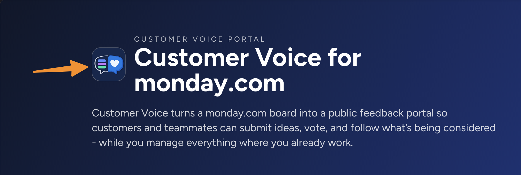
Footer branding
Show or hide the "Powered by Customer Voice app" footer on public pages.
Portal theme
Available in Pro
Theme customization is available on the Pro plan.
Free workspaces can preview the built-in themes in settings, but changing a theme requires Pro plan.
Pro workspaces can choose from built-in themes and adjust the portal style without adding custom code.
Built-in themes
Customer Voice includes multiple ready-to-use themes, including:
- Customer Voice: the default dark Customer Voice look.
- monday-like: a monday.com-inspired portal style.
- Neutral, Ocean, Forest, Sunset, Violet, Candy, Editorial, and Brutalist: modern alternatives with different colors, fonts, corners, and shadow styles.
Click a theme to preview it. On Pro, save settings to publish the selected theme to your public portal.
Theme mode
Use Theme mode to choose how the portal handles light and dark styles.
- Auto light/dark follows the visitor's browser preference.
- Always light keeps the portal in light mode.
- Always dark keeps the portal in dark mode.
Hero image
Use Hero image to add a background image to the portal header. 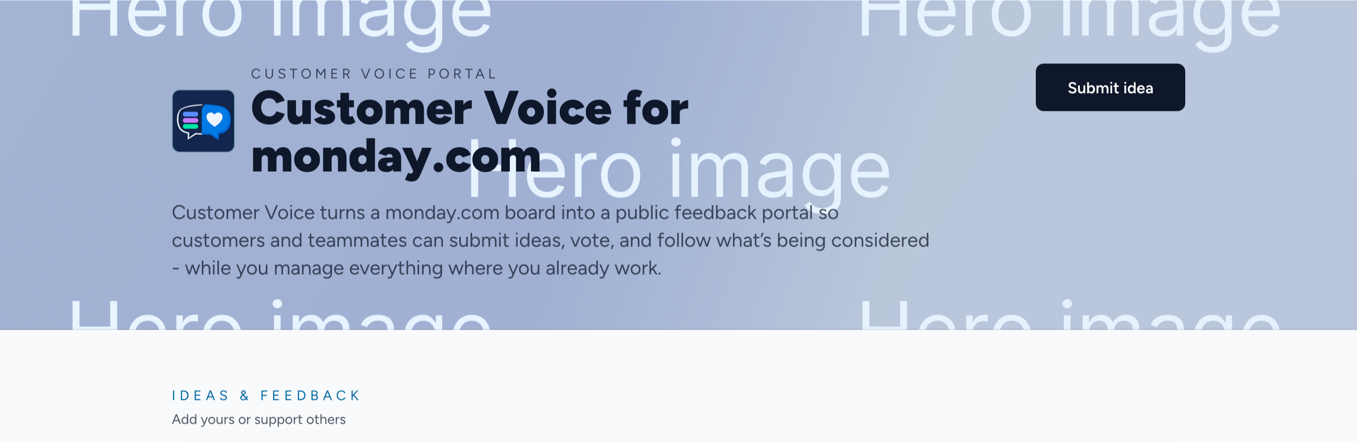
Use a wide image, ideally around 2400 × 800 px with an 8:3 aspect ratio. Keep important details near the center and avoid placing text in the image, because the portal may crop the edges on smaller screens.
The image is layered with the selected theme colors, so it can still work with text and buttons.
Customize theme
Use Customize theme to fine tune any theme to your taste.
You can customize:
- Colors for light and dark mode, including primary, accent, text, and hero gradient colors.
- Font from a curated list.
- Round corners for buttons, inputs, and panels.
- Shadows for panels and dialogs.
- Button shadows if you want stronger visual styles such as a more brutalist look.
Use Reset to default to remove advanced overrides and return to the selected theme defaults.